🐼📊 Pandas inbuilt.plot() methods#
👨🏫 Vikesh K
📓 Lab 04
💡 “It doesn’t get easier, you get better” 💡
📝Lab Agenda#
Pandas plotting
Plotly versions
Note
In the notebook, we will focus on thee pandas .plot() method. Its a powerful and a quick method to quickly visualise the charts just using Pandas. For some of the charts, we would also focus on the plotly extension to render an interactive chart.
Please read more about them in the original documentation
Importing modules#
import pandas as pd
import matplotlib.pyplot as plt
import numpy as np
Data Creation#
# framing a df
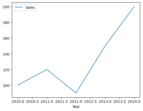
df_sales = pd.DataFrame({'Year': [2010, 2011, 2012, 2013, 2014],
                   'Sales': [100, 120, 90, 150, 200]})

# data plot
df_sales
| Year | Sales | |
|---|---|---|
| 0 | 2010 | 100 |
| 1 | 2011 | 120 |
| 2 | 2012 | 90 |
| 3 | 2013 | 150 |
| 4 | 2014 | 200 |
Line Plot#
Line Plot: Used to visualize the trend in data over time. This plot is useful when you want to analyze how a variable has changed over time
df_sales.plot(x ='Year', y ='Sales', kind='line');
Interactive Plotly Version
df_sales.plot(x ='Year', y ='Sales', kind ='line', backend = 'plotly')
Scatter Plot#
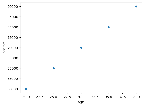
Scatter Plot: Used to visualize the relationship between two continuous variables. This plot is useful when you want to analyze the correlation between two variables.
df_age = pd.DataFrame({'Age': [20, 25, 30, 35, 40],
                   'Income': [50000, 60000, 70000, 80000, 90000]})

df_age.plot(x='Age', y='Income', kind='scatter');
Plotly version
df_age.plot(x='Age', y='Income', kind='scatter', backend = 'plotly')
Bar Plot#
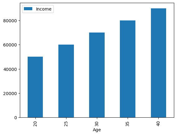
Bar Plot: Used to compare the values of a categorical variable. This plot is useful when you want to compare the values of a variable across different categories.
df_age.plot(x='Age', y='Income', kind='bar');
Plotly version
df_age.plot(x='Age', y='Income', kind='bar', backend = 'plotly')
Horizontal Bar Plot#
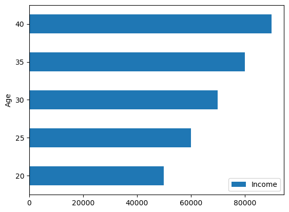
Horizontal Bar Plot: Similar to a bar plot, but with horizontal bars. This plot is useful when you want to compare the values of a variable across different categories and the category labels are long or have long names.
df_age.plot(x='Age', y='Income', kind='barh');
Plotly version
df_age.plot(x ='Age', y='Income', kind='barh', backend = 'plotly')
Stacked Bar Plot#
Stacked Bar Plot: Used to visualize the composition of a dataset. This plot is useful when you want to see the relative contribution of different parts of a dataset to the overall dataset, and also want to see how the relative contributions have changed over time or across different categories.
data = {
    'apples': [20, 10, 30, 25],
    'oranges': [10, 20, 10, 15],
    'pears': [15, 15, 10, 20],
}

df_fruits = pd.DataFrame(data, index=['Q1', 'Q2', 'Q3', 'Q4'])

# Create a stacked bar plot
df_fruits.plot(kind='bar', stacked=True);
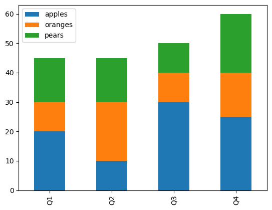
Note: Plotly doesn’t support Stacked version
Pie Chart#
Pie Chart: Used to visualize the composition of a dataset. This plot is useful when you want to see the relative contribution of different parts of a dataset to the overall dataset, but is generally not recommended due to issues with perception and comparison.
df = pd.DataFrame({'Category': ['A', 'B', 'C', 'D'],
                   'Sales': [200, 350, 400, 150]})
df.plot(y='Sales', kind='pie', labels=df['Category'], autopct='%1.1f%%')
plt.show()
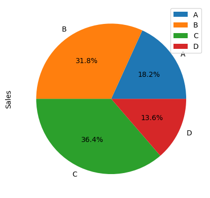
Plolty doesn’t support pie chart
Histogram#
Histogram Plot: Used to visualize the distribution of a dataset. This plot is useful when you want to see the frequency distribution of a continuous variable.
df = pd.Series(np.random.randn(1000))

# create a density plot of the dataset
df.plot(kind='hist');
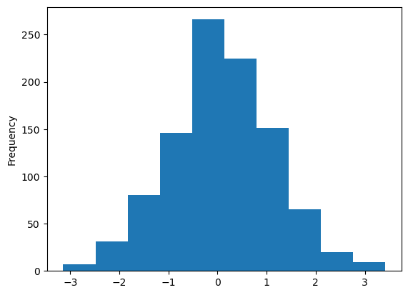
Plotly version
df.plot(kind='hist', backend = 'plotly')
Area Plot#
Area Plot: Used to visualize the composition of a dataset. This plot is useful when you want to see the relative contribution of different parts of a dataset to the overall dataset.
df_sales.plot(x ='Year', y='Sales', kind='area');
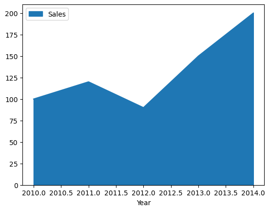
Plotly Chart
df_sales.plot(x='Year', y='Sales', kind='area', backend = 'plotly')
Box Plot#
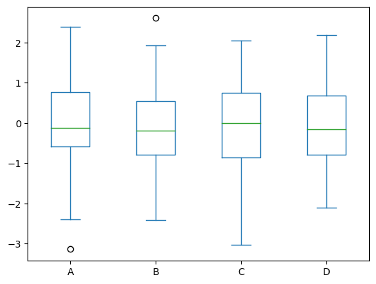
Box Plot: Used to visualize the distribution of a dataset through its quartiles. This plot is useful when you want to see the distribution of a variable and identify any outliers.
data = pd.DataFrame(np.random.randn(100, 4), columns=['A', 'B', 'C', 'D'])

# create a box plot of the dataset
data.plot(kind='box');
Plotly version
data.plot(kind='box', backend = 'plotly')
KDE Plot#
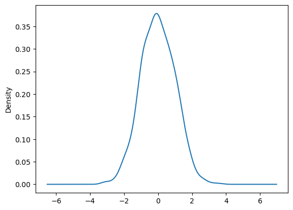
Kernel Density Estimation Plot: Used to estimate the probability density function of a continuous variable. This plot is useful when you want to see the probability distribution of a variable.
df = pd.Series(np.random.randn(1000))

# create a density plot of the dataset
df.plot(kind='kde');
Plotly doesn’t support kde charts
Density Plot#
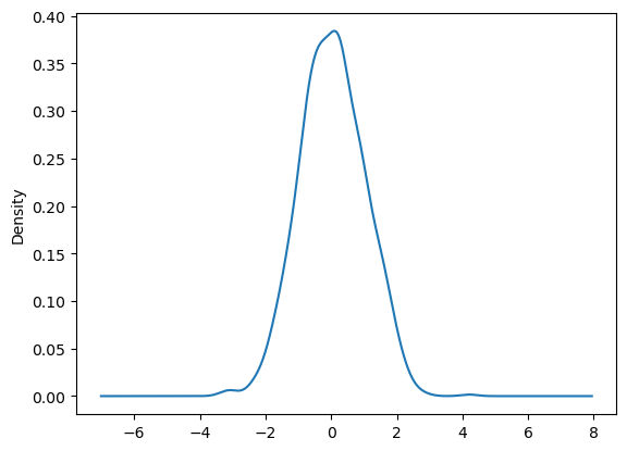
Density Plot: Used to visualize the density of a continuous variable. This plot is useful when you want to see the probability distribution of a variable.
Note: ‘density’ plot is same as ‘kde’ plot
df = pd.Series(np.random.randn(1000))

# create a density plot of the dataset
df.plot(kind='density');
Plotly doesn’t support density
Hexagonal Bin Plot#
Hexagonal Bin Plot: Used to visualize the distribution of a dataset through hexagonal bins. This plot is useful when you want to analyze the distribution of a dataset with a large number of points.
# df = pd.DataFrame(np.random.randn(1000, 2), columns=['A', 'B'])

# # create a hexagonal bin plot of the dataset
# df.plot(kind ='hexbin', x ='A', y ='B', gridsize =20);
Plotly doesn’t support Hexbins
📚 Reference material#
If you wish to know more about Data Visualisation and Storytelling. The below resources should be helpful.
