🤖 Support Vector Machines#
👨🏫 Vikesh K
📓 Lab-09
💡 “Work hard in silence. Let success make the noise” 💡
📝Lab Agenda#
We will cover:
Fitting SVM model to numerical data with its variants
Visualizing the decision boundaries of SVM
Comparing the SVM results against other Classifiers
Support Vector Machines Overview#
Technique : Classifies by finding a separator

Algo Steps#
Mapping data to a feature space
for example a data with two data columns gets mapped to a 2-d chart, forming a line
Here lies one challenge, we need to map the data in the manner to highlight the differences between the values
This process is called
kernellingand mathemtical function iskernel
Find a separator between the points that maximises the margin
It will be a straight line in two dimensional space and a hyperplane in higher dimensions
The separator placement is determined by the values closer to the margin, hence called
support vectors
Advantages#
Accurate in high-dimensional spaces
Memory efficient; as it doesn’t rely on the complete data and relies only on support vectors
Disadvantages#
Prone for over-fitting if features is much greater than samples
No probability estimation
Usages#
Good for Image recognition
Effective in text mining; especially due to efficiency in high-dimensional data
Good for Gene Classification
Other classification tasks
📓 Case Study : Wine Data#

Note
In Python, whenever you want to run/launch a package, you need to import it.
In the smart phone analogy, this is equal to tapping on an app to start it. You would have pre-installed apps and apps that you need to install.
Remember, like in a phone’s pre-installed apps, os is one of the pre-installed apps.**
You won’t get any message if a package is imported successfully. Only if you do a wrong loading, error message will be shown
We are dealing with wine dataset. It deals with different categories of the wine. https://archive.ics.uci.edu/ml/datasets/wine
Data Set Information:
These data are the results of a chemical analysis of wines grown in the same region in Italy but derived from three different cultivars. The analysis determined the quantities of 13 constituents found in each of the three types of wines.
The attributes are :
Alcohol
Malic acid
Ash
Alcalinity of ash
Magnesium
Total phenols
Flavanoids
Nonflavanoid phenols
Proanthocyanins
Color intensity
Hue
Proline
Data load and inspect#
## libraries
import pandas as pd
import numpy as np

# data viz
import matplotlib.pyplot as plt
import seaborn as sns
plt.style.use('fivethirtyeight')
# plt.rcdefaults() # to get the default plot


# ml models
from sklearn.svm import SVC #Support vector classifier
from sklearn.linear_model import LogisticRegression
from sklearn.tree import DecisionTreeClassifier
from sklearn.ensemble import RandomForestClassifier


# for ignoring warnings
import warnings
warnings.simplefilter("ignore")

print("All modules loaded properly")
All modules loaded properly
# loading the datasets
df = pd.read_csv("https://raw.githubusercontent.com/vkoul/data/main/misc/wine.csv")
df.shape
(178, 14)
Inspect the data
# how to get the shape of the data
print(df.shape)

# How to get the column data types
print(df.info())

# how to check for few initial rows
display(df.head(5))
(178, 14)
<class 'pandas.core.frame.DataFrame'>
RangeIndex: 178 entries, 0 to 177
Data columns (total 14 columns):
 #   Column                Non-Null Count  Dtype
---  ------                --------------  -----
 0   Wine                  178 non-null    int64
 1   Alcohol               178 non-null    float64
 2   Malic.acid            178 non-null    float64
 3   Ash                   178 non-null    float64
 4   Acl                   178 non-null    float64
 5   Mg                    178 non-null    int64
 6   Phenols               178 non-null    float64
 7   Flavanoids            178 non-null    float64
 8   Nonflavanoid.phenols  178 non-null    float64
 9   Proanth               178 non-null    float64
 10  Color.int             178 non-null    float64
 11  Hue                   178 non-null    float64
 12  OD                    178 non-null    float64
 13  Proline               178 non-null    int64
dtypes: float64(11), int64(3)
memory usage: 19.6 KB
None
| Wine | Alcohol | Malic.acid | Ash | Acl | Mg | Phenols | Flavanoids | Nonflavanoid.phenols | Proanth | Color.int | Hue | OD | Proline | |
|---|---|---|---|---|---|---|---|---|---|---|---|---|---|---|
| 0 | 0 | 14.23 | 1.71 | 2.43 | 15.6 | 127 | 2.80 | 3.06 | 0.28 | 2.29 | 5.64 | 1.04 | 3.92 | 1065 |
| 1 | 0 | 13.20 | 1.78 | 2.14 | 11.2 | 100 | 2.65 | 2.76 | 0.26 | 1.28 | 4.38 | 1.05 | 3.40 | 1050 |
| 2 | 0 | 13.16 | 2.36 | 2.67 | 18.6 | 101 | 2.80 | 3.24 | 0.30 | 2.81 | 5.68 | 1.03 | 3.17 | 1185 |
| 3 | 0 | 14.37 | 1.95 | 2.50 | 16.8 | 113 | 3.85 | 3.49 | 0.24 | 2.18 | 7.80 | 0.86 | 3.45 | 1480 |
| 4 | 0 | 13.24 | 2.59 | 2.87 | 21.0 | 118 | 2.80 | 2.69 | 0.39 | 1.82 | 4.32 | 1.04 | 2.93 | 735 |
Understanding the Target Variable
We are trying to predict the type of wine based on chemical properties
df['Wine'].value_counts()
Wine
1    71
0    59
2    48
Name: count, dtype: int64
df['Wine'].value_counts().plot(kind = 'bar', backend = 'plotly')
Note
We will focus on subset of column for prediction to make it easy to visualize the results later
Select only three columns - “Wine”, “Alchol” and “Malic Acid”
# Select only the three columns required for our analysis

# Wine, Alcohol, Malic.acid
selection = ["Wine", "Alcohol", "Malic.acid"]

df = df[selection]
df.head()
| Wine | Alcohol | Malic.acid | |
|---|---|---|---|
| 0 | 0 | 14.23 | 1.71 |
| 1 | 0 | 13.20 | 1.78 |
| 2 | 0 | 13.16 | 2.36 |
| 3 | 0 | 14.37 | 1.95 |
| 4 | 0 | 13.24 | 2.59 |
Data Viz#
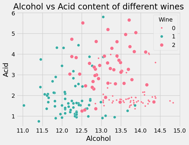
Plot the appropriate chart
# name the axis, titles
plt.xlabel("Alcohol")
plt.ylabel("Acid")
plt.title("Alcohol vs Acid content of different wines")


# plot the chart between Alchohol and Malic Alic acid, with color given by Wine
sns.scatterplot(x="Alcohol", y="Malic.acid", data=df, s=20, hue="Wine", palette="husl", size='Wine');
Data Modeling#
Note
Function to generate classification plots
❗❗ You don’t need to understand it at this stage. This is used to generate plots at the end.❗❗
import numpy as np
import matplotlib.pyplot as plt
# Source: Mike Gelbart

def make_meshgrid(x, y, h=.02, lims=None):

    """Create a mesh of points to plot in

    Parameters
    ----------
    x: data to base x-axis meshgrid on
    y: data to base y-axis meshgrid on
    h: stepsize for meshgrid, optional

    Returns
    -------
    xx, yy : ndarray
    """

    if lims is None:
        x_min, x_max = x.min() - 1, x.max() + 1
        y_min, y_max = y.min() - 1, y.max() + 1
    else:
        x_min, x_max, y_min, y_max = lims
    xx, yy = np.meshgrid(np.arange(x_min, x_max, h),
                         np.arange(y_min, y_max, h))
    return xx, yy

def plot_contours(ax, clf, xx, yy, proba=False, transformation=None, **params):
    """Plot the decision boundaries for a classifier.
    Parameters
    ----------
    ax: matplotlib axes object
    clf: a classifier
    xx: meshgrid ndarray
    yy: meshgrid ndarray
    params: dictionary of params to pass to contourf, optional
    """

    X = np.c_[xx.ravel(), yy.ravel()]
    if transformation is not None:
        X = transformation(X)
        # xx = np.reshape(X[:,0], xx.shape)
        # yy = np.reshape(X[:,1], yy.shape)


    if proba:
        if hasattr(clf, 'predict_proba'):
            Z = clf.predict_proba(X)[:,-1]
            Z = Z.reshape(xx.shape)
            out = ax.imshow(Z,extent=(np.min(xx), np.max(xx), np.min(yy), np.max(yy)), origin='lower', vmin=0, vmax=1, **params)
            ax.contour(xx, yy, Z, levels=[0.5])
        else:
            Z = clf.decision_function(X)
            Z = Z.reshape(xx.shape)
            out = ax.contourf(xx, yy, Z, **params)
    else:
        Z = clf.predict(X)
        Z = Z.reshape(xx.shape)
        out = ax.contourf(xx, yy, Z, **params)
    return out


def plot_classifier(X, y, clf, ax=None, ticks=False, proba=False, lims=None): # assumes classifier "clf" is already fit
    X0, X1 = X.iloc[:,0], X.iloc[:,1]
    xx, yy = make_meshgrid(X0, X1, lims=lims)

    if ax is None:
        plt.figure()
        ax = plt.gca()
        show = True
    else:
        show = False

    # can abstract some of this into a higher-level function for learners to call
    cs = plot_contours(ax, clf, xx, yy, cmap=plt.cm.coolwarm, alpha=0.8, proba=proba)
    if proba:
        cbar = plt.colorbar(cs)
        cbar.ax.set_ylabel('probability of red $\Delta$ class', fontsize=20, rotation=270, labelpad=30)
        cbar.ax.tick_params(labelsize=14)
    #ax.scatter(X0, X1, c=y, cmap=plt.cm.coolwarm, s=30, edgecolors='k', linewidth=1)
    labels = np.unique(y)
    if len(labels) == 2:
        ax.scatter(X0[y==labels[0]], X1[y==labels[0]], cmap=plt.cm.coolwarm, s=60, c='b', marker='o', edgecolors='k')
        ax.scatter(X0[y==labels[1]], X1[y==labels[1]], cmap=plt.cm.coolwarm, s=60, c='r', marker='^', edgecolors='k')
    else:
        ax.scatter(X0, X1, c=y, cmap=plt.cm.coolwarm, s=50, edgecolors='k', linewidth=1)

    ax.set_xlim(xx.min(), xx.max())
    ax.set_ylim(yy.min(), yy.max())
#     ax.set_xlabel(data.feature_names[0])
#     ax.set_ylabel(data.feature_names[1])
    if ticks:
        ax.set_xticks(())
        ax.set_yticks(())
#     ax.set_title(title)
    if show:
        plt.show()
    else:
        return ax

print("Code successfully ran")
Code successfully ran
Create the Feature and Target Variable#
# Create two data-frames.
# X with only the features
# y with only the target values

# Drop wine column for X and retain only Wine for y
x = df.drop(columns = "Wine")
y = df["Wine"]

# check the shape of data
print(x.shape)
print(y.shape)

# check the type of data
print(type(x))
print(type(y))
(178, 2)
(178,)
<class 'pandas.core.frame.DataFrame'>
<class 'pandas.core.series.Series'>
Standard Scaling#
Since the SVM classifier uses distances metrics, we would need to standardize the data before using the classifier
Read: Why Feature Scaling in SVM?
from sklearn.preprocessing import StandardScaler
# intiate
scaler = StandardScaler()

# fit and transform
x_scaled = scaler.fit_transform(x)
Converting the numpy array into pandas df for ease of use
x_scaled = pd.DataFrame(x_scaled, columns = x.columns)
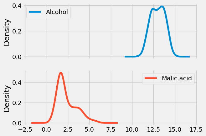
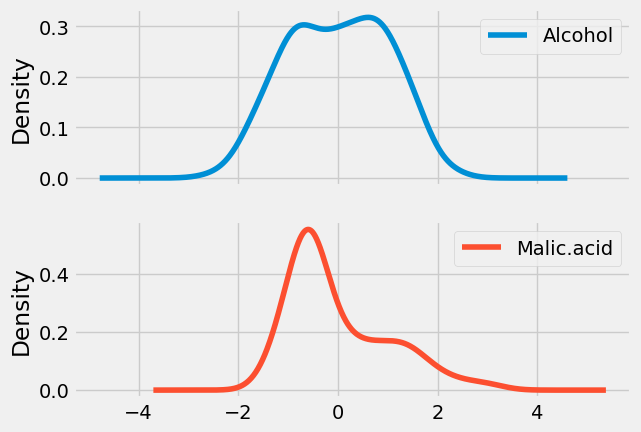
Visually inspect the impact of Scaling
Density plot of UNscaled data
x.plot(kind = 'kde', subplots = True);
Density plot of Scaled data
x_scaled.plot(kind = 'kde', subplots = True);
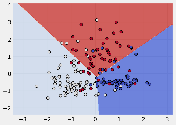
Building a SVM Classifier#
# call the model
svm = SVC(kernel = "linear")

# fit the model
svm.fit(x_scaled,y)

# plot the classification done by model
plot_classifier(x_scaled, y, svm) # the lims stand for axis limits
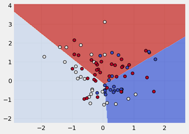
Highlighting the use of support vectors#
# get the dimensions of the data
print("Number of original examples:", len(x))
print("Number of support vectors:", len(svm.support_))

# Extract only the support vectors from data
x_small = x_scaled.iloc[svm.support_]
y_small = y.iloc[svm.support_]

# # Train a new SVM using only the support vectors
svm_small = SVC(kernel = "linear")
svm_small.fit(x_small, y_small)
plot_classifier(x_small, y_small, svm_small)
Number of original examples: 178
Number of support vectors: 82
Note
Changing the Kernels
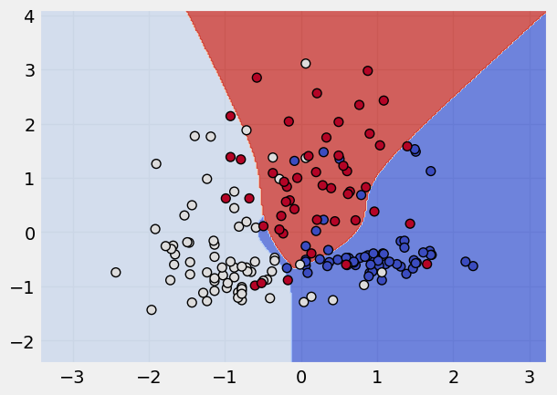
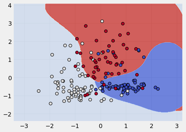
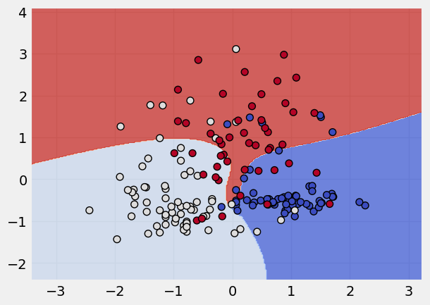
The SVM algorithm offers a choice of kernel functions for performing its processing. Basically, mapping data into a higher dimensional space is called kernelling. The mathematical function used for the transformation is known as the kernel function, and can be of different types, such as:
1.Linear 2.Polynomial 3.Radial basis function (RBF) 4.Sigmoid
Each of these functions has its characteristics, its pros and cons, and its equation, but as there’s no easy way of knowing which function performs best with any given dataset, we usually choose different functions in turn and compare the results.
# making a list of the different kernel functions
kernel_states = ["linear", "poly", "rbf", "sigmoid"]

# applying a loop to apply these kernel states
for k in kernel_states:
    print("The kernel applied is:", k)
    svm = SVC(kernel = k)
    svm.fit(x_scaled,y)
    plot_classifier(x_scaled, y, svm)
The kernel applied is: linear

The kernel applied is: poly
The kernel applied is: rbf
The kernel applied is: sigmoid
Comparison of SVM with other Classification Models#
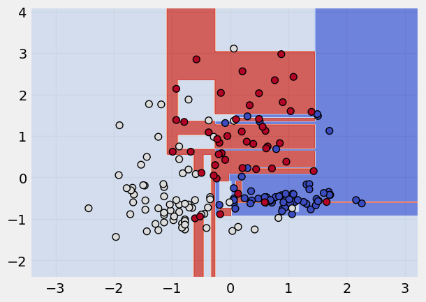
Decision Tree Classifier#
Read more about Decision Tree Classifier
# call the model
dt = DecisionTreeClassifier()

# fit the model
dt.fit(x_scaled,y)

# plot the classification
plot_classifier(x_scaled, y, dt)
Random Forest Classifier#
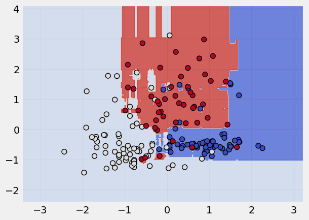
Read more about Random Forest here
rf = RandomForestClassifier()
rf.fit(x_scaled,y)
plot_classifier(x_scaled, y, rf)
Logistic Regression Classifier#
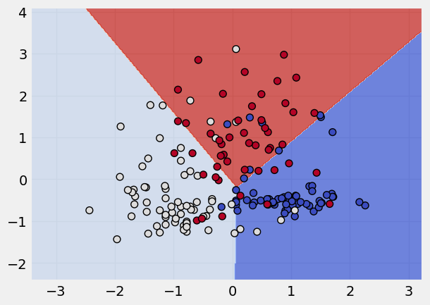
Read more about Logistic Classifer here
# calling the object
lg = LogisticRegression()

# fitting the model
lg.fit(x_scaled,y)

# data viz the classification
plot_classifier(x_scaled, y, lg)
📚 Reference material#
Kernels
Data Viz
Analysis
Python Data Science handbook - very useful book if you want to learn how to do data science using python. Covers data manipulation, data visualisation and machine learning. Freely available
