🌀Clustering#
👨🏫 Vikesh K
📓 Lab-10
💡 “Learn as if you will live forever, live like you will die tomorrow.” 💡
📝 Lab Agenda#
We will cover:
Basics of Clustering
Case Study
Clustering Overview#
Partitions the data into mutually exclusive groups (clusters)
Group of objects that are similar to each other in the cluster, and dissimilar to data points in other clusters
Difference between Clustering and Classification#
In Classification, we have already labelled the dataset to a category. For example, we can divide our customers on the basis of gender, demographics etc.
In clustering, we don’t do any labeling on the data, instead we pass it through a ML model and let it discover clusters in the dataset
Why Clustering?#
Exploratory data analysis- helps you to quickly see patterns in data
Outlier Detection - the outliers will form a separate group from the rest
Pre-processing step for predictions - Many predictions are more accurate after doing it for clusters
Clustering Algos#
Partion based -
K-means- efficient to deal with and are used for medium and large sized daatsetsHierarchial -
Hierarchical clustering- produce trees of clusters; generally good for small sized datasets
Clustering Applications#
Retail-
Identify the buying patterns of customers and generate profiles.
Can also be used in recommendation systems to club togther similar items or users
Banking -
Fraud detection; normal usage clusters vs suspicious usage clusters
Customer segmentation
Insurance
Fraud detection
Media - Automatically categorise news based on their content
Genetics - Clustering genetic markers to indetify ties

source: dataflair
Visualise K- Means#
Data load and inspect#
We are using an a very simple data to focus on the process and method rather than data complications. Data is taken from the book ML using Python
## libraries
import pandas as pd
import numpy as np

# data viz
import matplotlib.pyplot as plt
import seaborn as sns

# data pre-processing
from sklearn.preprocessing import StandardScaler

# K-Means cluster
from sklearn.cluster import KMeans

# for ignoring warnings
import warnings
warnings.simplefilter("ignore")
# loading the datasets
url = 'https://raw.githubusercontent.com/vkoul/data/main/misc/customerspends.csv'

df = pd.read_csv(url)
Inspect the data#
# how to get the shape of the data
print(df.shape)

# How to get the column data types
print(df.info())

# how to check for few initial rows
display(df.head())
(20, 3)
<class 'pandas.core.frame.DataFrame'>
RangeIndex: 20 entries, 0 to 19
Data columns (total 3 columns):
 #   Column                 Non-Null Count  Dtype
---  ------                 --------------  -----
 0   Customer               20 non-null     int64
 1   Apparel                20 non-null     float64
 2   Beauty and Healthcare  20 non-null     float64
dtypes: float64(2), int64(1)
memory usage: 608.0 bytes
None
| Customer | Apparel | Beauty and Healthcare | |
|---|---|---|---|
| 0 | 1 | 21.10 | 0.7 |
| 1 | 2 | 15.23 | 5.5 |
| 2 | 3 | 5.22 | 18.6 |
| 3 | 4 | 31.10 | 1.8 |
| 4 | 5 | 6.12 | 21.5 |
# missing values
df.isna().sum()
Customer                 0
Apparel                  0
Beauty and Healthcare    0
dtype: int64
Since the Customer column is only for identification. We will recast it as an index
df = df.set_index("Customer")
EDA#
df.describe()
| Apparel | Beauty and Healthcare | |
|---|---|---|
| count | 20.000000 | 20.000000 |
| mean | 13.463000 | 9.788000 |
| std | 8.780425 | 7.359884 |
| min | 4.250000 | 0.700000 |
| 25% | 5.895000 | 2.725000 |
| 50% | 13.575000 | 7.750000 |
| 75% | 16.697500 | 16.575000 |
| max | 31.100000 | 21.500000 |
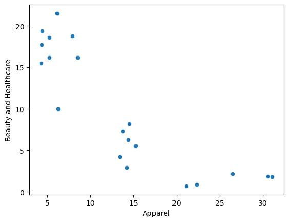
sns.scatterplot(data = df, x = "Apparel", y = "Beauty and Healthcare");
Pre-processing : Scaling the data#
df_scaled = df.copy()
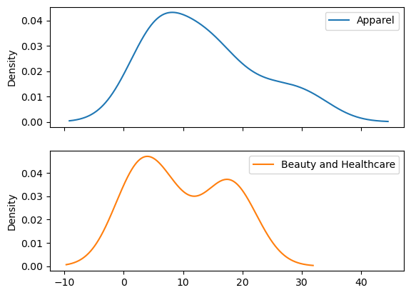
df_scaled.plot(kind = "kde", subplots = True);
# launching the scaler
scaler = StandardScaler()

# do the fit transform
df_scaled[['Apparel', "Beauty and Healthcare"]] = scaler.fit_transform(df_scaled[['Apparel', "Beauty and Healthcare"]])
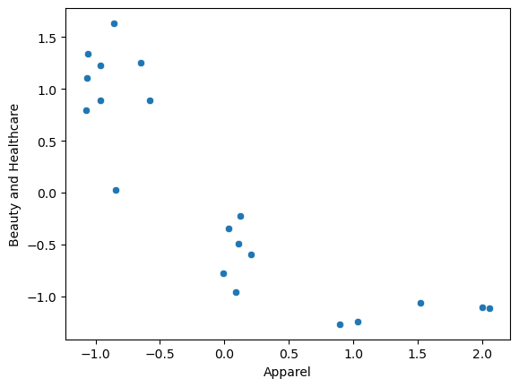
As the two columns were roughly on the same scale, there was not much difference post scaling
sns.scatterplot(data = df_scaled, x = "Apparel", y = "Beauty and Healthcare");
Clustering#
# # how many cluster do we want?
clusterNum = 3

# Method we are using?
k_means = KMeans(init = "k-means++", n_clusters = clusterNum, random_state = 123)

# ‘k-means++’ : selects initial cluster centers for k-mean clustering in a smart way to speed up convergence

# fit the model
k_means.fit(df_scaled)

# get the labels from the model
labels = k_means.labels_

# Inertia value of k-means
print("interia: " + str(k_means.inertia_))

print(labels)
interia: 3.505427667354255
[2 1 0 2 0 1 0 2 0 1 0 1 0 0 2 0 1 2 1 0]
You can also get the cluster centres
k_means.cluster_centers_
array([[-0.89566872,  1.01899349],
       [ 0.09157017, -0.56569101],
       [ 1.50231949, -1.15535907]])
The cluster centre values are scaled. If we want to show them in the original plot, we would need to scale back the data to original levels and use that
rescaled_centres = scaler.inverse_transform(k_means.cluster_centers_)
cc_pd = pd.DataFrame(rescaled_centres, columns=['apparel_center', 'beauty_center'])
cc_pd
| apparel_center | beauty_center | |
|---|---|---|
| 0 | 5.797778 | 17.097778 |
| 1 | 14.246667 | 5.730000 |
| 2 | 26.320000 | 1.500000 |
Assigning back the cluster info to the dataset
# adding the labels as a column back to the dataset
df["cluster"] = labels
df.head(5)
| Apparel | Beauty and Healthcare | cluster | |
|---|---|---|---|
| Customer | |||
| 1 | 21.10 | 0.7 | 2 |
| 2 | 15.23 | 5.5 | 1 |
| 3 | 5.22 | 18.6 | 0 |
| 4 | 31.10 | 1.8 | 2 |
| 5 | 6.12 | 21.5 | 0 |
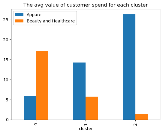
Check the mean values by each cluster group
# check the mean for all the values
df.groupby("cluster").agg(["mean", "median", "std"]).round(2)
| Apparel | Beauty and Healthcare | |||||
|---|---|---|---|---|---|---|
| mean | median | std | mean | median | std | |
| cluster | ||||||
| 0 | 5.80 | 5.22 | 1.55 | 17.10 | 17.70 | 3.26 |
| 1 | 14.25 | 14.30 | 0.64 | 5.73 | 5.89 | 1.96 |
| 2 | 26.32 | 26.50 | 4.60 | 1.50 | 1.80 | 0.66 |
# check the mean for all the values
df.groupby("cluster").mean().round(2).plot(kind = "bar", title = "The avg value of customer spend for each cluster");
Plotting the difference between age and Income
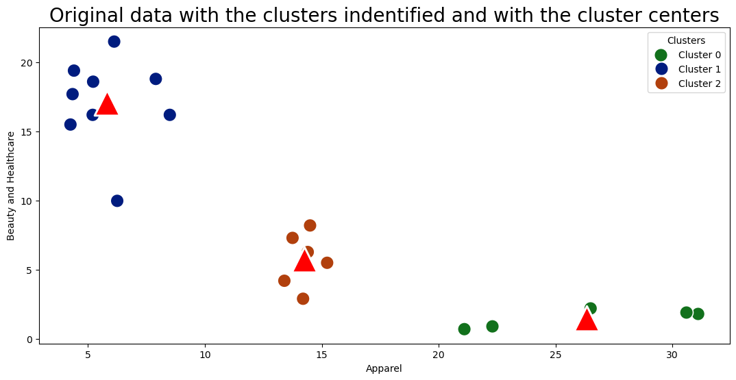
We will use two different chart types in seaborn to plot it
# plot size
plt.figure(figsize = (13,6))
sns.scatterplot(data = df, x = "Apparel", y = "Beauty and Healthcare", hue = "cluster", palette = "dark", s = 200);

sns.scatterplot(x = "apparel_center", y = "beauty_center", data = cc_pd, s=700, marker='^', color='red');

legend_labels = ["Cluster 0", "Cluster 1", "Cluster 2"]
plt.legend(title="Clusters", labels=legend_labels)
plt.title("Original data with the clusters indentified and with the cluster centers", fontsize = 20);
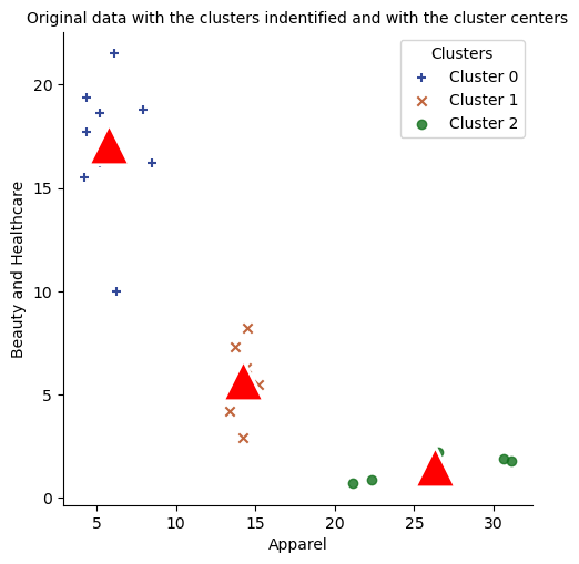
Alternative way
# plot size
markers = ["+", "x", "o"]

sns.lmplot(data = df, x = "Apparel", y = "Beauty and Healthcare", hue = "cluster"
           , palette = "dark",  markers = markers, fit_reg = False, legend = False);

sns.scatterplot(x = "apparel_center", y = "beauty_center", data = cc_pd, s=700, marker='^', color='red');

legend_labels = ["Cluster 0", "Cluster 1", "Cluster 2"]
plt.legend(title="Clusters", labels=legend_labels);
plt.title("Original data with the clusters indentified and with the cluster centers", fontsize = 10);
Note
In the above seaborn command, we are using palette = "dark" argument. You should have the >=0.11 version of the seaborn to run this succesfully.
# check your seaborn version
print(sns.__version__)

# if your version is not latest run the below command
!pip install seaborn --upgrade
Right value of K?#
Elbow method#
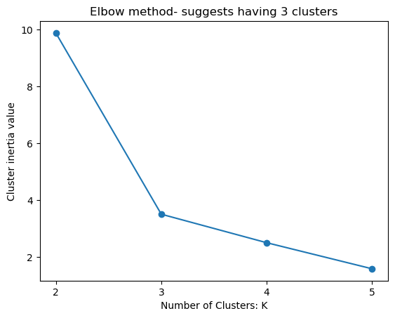
The Elbow Method is a graphical representation used to find the optimal number of clusters in a dataset. It is a heuristic method that helps determine the number of clusters by plotting the explained variation as a function of the number of clusters.
The method only uses intra-cluster distances and is easy to implement, but it can be subjective and unreliable, especially for datasets with complex structures.
k_values = range(2,6)
inertia_values = []

for k in range(2,6):

    # Method we are using?
    k_means = KMeans(init = "k-means++", n_clusters = k, random_state = 123)

    # fit the model
    k_means.fit(df_scaled)

    # print(k_means.labels_)

    # get the labels from the model
    inertia_values.append(k_means.inertia_)
plt.plot(k_values, inertia_values, marker = "o");

plt.xlabel("Number of Clusters: K")
plt.ylabel("Cluster inertia value")
plt.title("Elbow method- suggests having 3 clusters")
plt.xticks([2,3,4,5]);
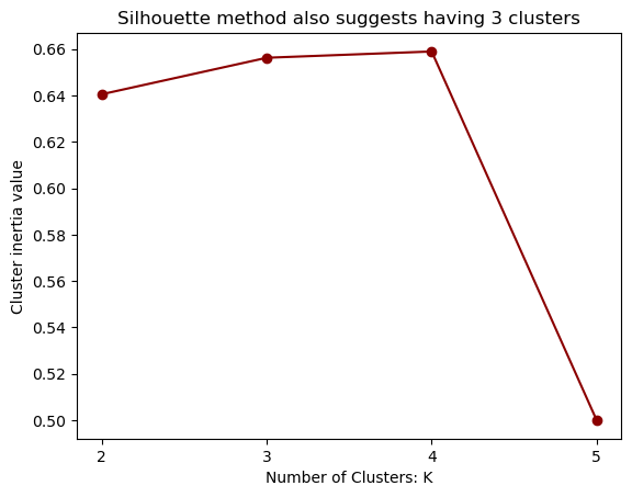
Silhouette Score#
Silhouette Score measures how well a data point fits into its own cluster compared to other clusters, using both intra-cluster and inter-cluster distances
The score ranges from -1 to +1, where a high positive value indicates that the data point is well-clustered and distinctly separated from other clusters, suggesting a meaningful clustering result.
A negative score implies that the data point may be assigned to the wrong cluster. A score close to 0 indicates that the data point is on or very close to the decision boundary between clusters, suggesting that the clustering is not well-defined and can be ambiguous
from sklearn.metrics import silhouette_score
silhouette_scores = []

for k in range(2,6):

    # Method we are using?
    k_means = KMeans(init = "k-means++", n_clusters = k, random_state = 123)

    # fit the model
    k_means.fit(df_scaled)

    # print(k_means.labels_)

    # get the labels from the model
    silhouette_scores.append(silhouette_score(df_scaled, k_means.labels_))
plt.plot(k_values, silhouette_scores, marker = "o", color = "darkred");

plt.xlabel("Number of Clusters: K")
plt.ylabel("Cluster inertia value")
plt.title("Silhouette method also suggests having 3 clusters")
plt.xticks([2,3,4,5]);
Dendograms#
This method is not used a lot, however good to be aware about it.
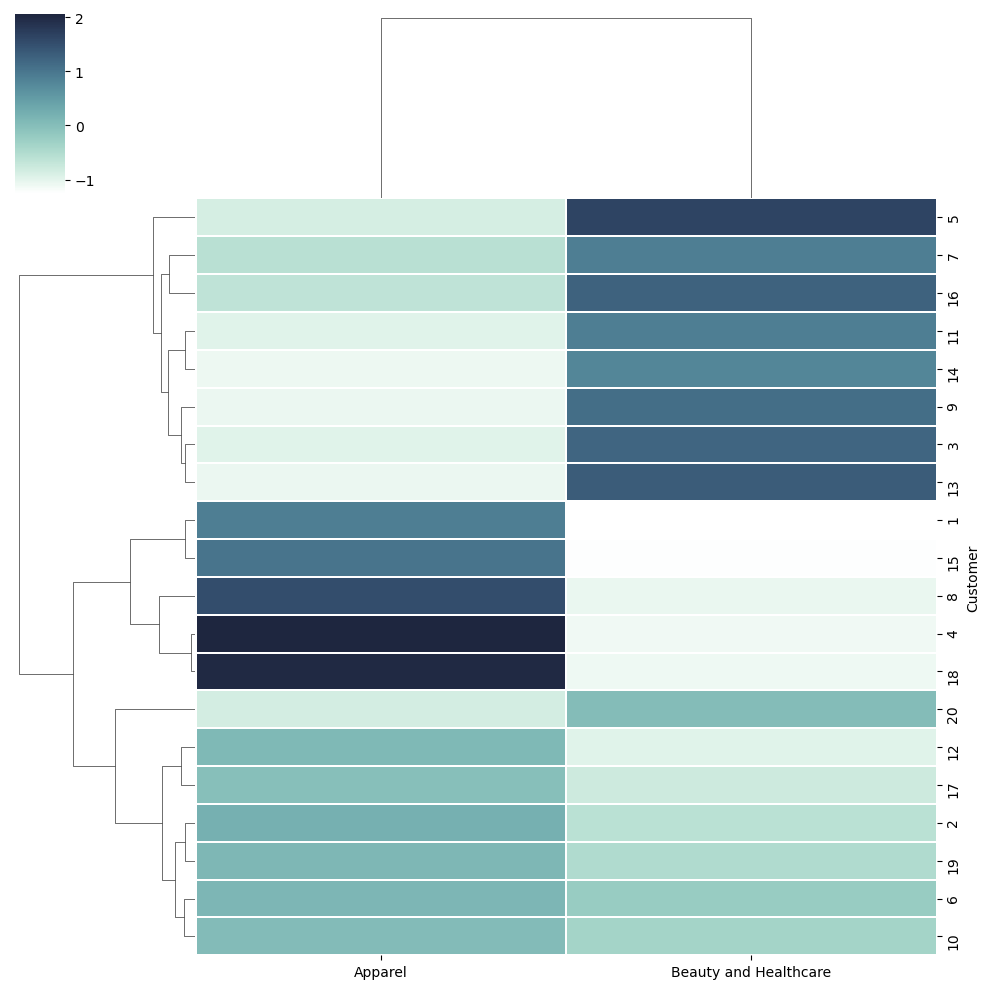
Dendograms is a cluster tree diagram that groups those entities together that are nearer to each other. Seaborn’s clustermap() allows us to draw the dendograms.
You need to focus on the tree on the left of the dendogram. They show how the values are clubbed togther and which one is closer to each other.
cmap = sns.cubehelix_palette(as_cmap = True, rot = -.3, light = 1)
sns.clustermap(df_scaled, cmap = cmap, linewidth = .2);
Hierarchial Clustering#
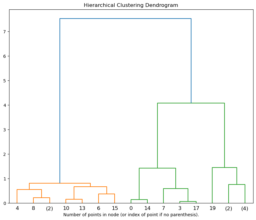
It creates a tree of clusters known as a dendrogram, where the root is the single cluster containing all the data points, and the leaves are the individual data points.
It does not require the number of clusters to be specified in advance, and the number of clusters can be determined by interpreting the dendrogram.
from sklearn.cluster import AgglomerativeClustering
from scipy.cluster.hierarchy import dendrogram

# for plotting dendogram
def plot_dendrogram(model, **kwargs):
    # Create linkage matrix and then plot the dendrogram

    # create the counts of samples under each node
    counts = np.zeros(model.children_.shape[0])
    n_samples = len(model.labels_)
    for i, merge in enumerate(model.children_):
        current_count = 0
        for child_idx in merge:
            if child_idx < n_samples:
                current_count += 1  # leaf node
            else:
                current_count += counts[child_idx - n_samples]
        counts[i] = current_count

    linkage_matrix = np.column_stack([model.children_, model.distances_,
                                      counts]).astype(float)

    # Plot the corresponding dendrogram
    dendrogram(linkage_matrix, **kwargs)
# calling the model
hie_clust = AgglomerativeClustering(n_clusters = None, distance_threshold=0)

# applying the model
hie_clust.fit(df_scaled)
AgglomerativeClustering(distance_threshold=0, n_clusters=None)In a Jupyter environment, please rerun this cell to show the HTML representation or trust the notebook.
On GitHub, the HTML representation is unable to render, please try loading this page with nbviewer.org.
AgglomerativeClustering(distance_threshold=0, n_clusters=None)
Plot the top three levels of the dendrogram
plt.figure(figsize = (10, 8))

plot_dendrogram(hie_clust, truncate_mode='level', p=3)
plt.xlabel("Number of points in node (or index of point if no parenthesis).")
plt.title('Hierarchical Clustering Dendrogram')

plt.show()
